


Oct 15, 2026
A New Look for the Warriors: One Gold, One Head, One Guide
Warriors Gold is now #FCB513 everywhere, the head gets a one-color version for social profiles, and the full brand guide is public at pghwarriorhockey.org/brand.
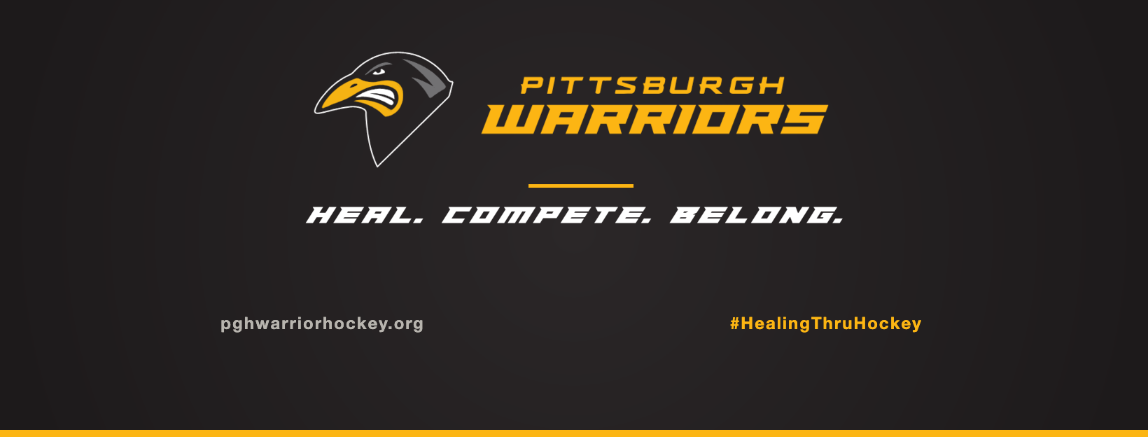
The Pittsburgh Warriors have a new look, and it starts with one color. Warriors Gold is now #FCB513 everywhere the club shows up: the website, social media, print, and anything new we make from here.
The Warriors head is the first thing most people see. On Facebook, Instagram and YouTube it now appears as a single black head on gold, drawn to stay sharp at the size of a phone profile picture. The full-color logo and the full-color head stay where there is room for them: covers, banners and big graphics.
Did we change the logo? No. The Pittsburgh Warriors logo on our jerseys, banners and website is the same one it has always been. What changed is the brand guide: the gold is now one exact color, and we picked the right version of the head for each place it shows up. A small round profile picture is one of those places, and a single-color head holds up there better than the full logo does.
The new Facebook cover and YouTube banner use the head and Pittsburgh Warriors lettering side by side, with the motto underneath: Heal. Compete. Belong. It sits centered on Soft Black (#221F20) so it holds up when Facebook crops covers on phones.
Healing Through Hockey is still how we describe what we do. The motto goes on athletic lockups, and Healing Through Hockey is the line for outreach and press.
The full guide is public at pghwarriorhockey.org/brand. It has the logos, the core colors, the minimum sizes, and the rules for using them. If you are a sponsor, a partner, a reporter, or a team putting the Warriors on a flyer, start there.
Players, you will see the new gold and the new head show up across the site and our social pages over the next few days. The Warriors app follows later.